|
When designing a website, there's so much more to think about than the average business owner expects. In order to get you thinking critically about your own website, I've performed a critique of a client's previous website. I've blurred out the identifying aspects of the company, and rebranded their actual live site. This post is an in-depth review of that anonymous website to highlight the importance of different elements. I've included some links to external sources if something specific sparks your interest. Let the critique begin. HOMEPAGE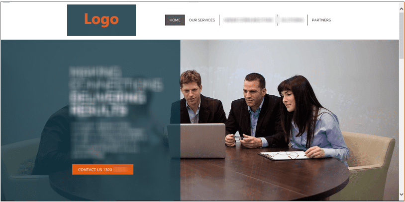 A simple, clean website theme utilising company colours of dark grey, orange and a steel blue. The current design has a large slider enveloping the above-the-fold real estate. The divided opaque pane says the company tag line, followed by some company specific text and a “contact us” button. The current website was created for the sole purpose to have a web presence. While functioning and complete, there is room for improvement to better follow 2017 design trends and reach the target market. Navigation Header Across the top of the site is a clean white header, with the logo and menu navigation. Keeping this header clean is a strong decision to declutter, focus the audiences’ attention and simplify the design. Many websites use the top right corner of their website to link the social media, shopping carts or a search box. At the time of the review, the company did not have a strong presense on social media, and in my opinion had made the right decision to exclude them from the prime placement of the header. This decision may be worth re visiting once a social media presence has been developed and effective. This space may also be utilised to link to the content of relevant blogs. Current navigation/pages included wording such as "our services". The navigation of a website is crucial to conversions. In my opinion, a lot of websites are doing a poor job at utilising the navigation, and the current website navigation could be adjusted to better align with what the customer is seeking, and what they expect to get out of visiting the website. Simple changes can make a big difference in the perceived value. For example, rewording “our services” to be “how we can help”, shifts the tone of the website from “look at me, we do stuff” to “we care about you and your business”. These are relatively quick and easy changes which affect the tone of the website to a more casual down to earth tone that the company is trying to portray in its branding. This is also true throughout the entirety of the website and branding. Change the voice to be more meaningful to the reader. Home Page Slider The full width slider or “hero image” has been on trend for several years, according to a design blog from last year, it’s seen as a visual and engaging way to stand out and a “strong visual experience that encourages you to scroll down to read more.”. Unfortunately, recent studies have concluded that sliders do not work for several reasons:
Home page recommendations:
CONTENT PAGES 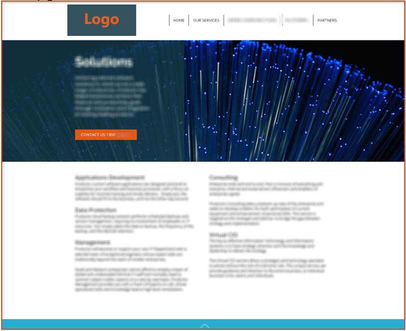 Content pages also include the same slider from the home page, with varied content. Although providing consistency throughout the site, it monopolises a lot of space, and without scrolling down, does not accurately provide much meaning or value to the viewer. The content itself increases audience effort using terminology and tone with no clear benefit or message that grabs the viewers’ attention. Skimming the headers and picking up every couple of words as most viewers do, there is no value to the text, and again focuses on the company instead of the prospect or customer. Content page recommendations:
 SUMMARY The website's flaws are all too common, existing for the sole reason that a business today without a website doesn't exist. However, like most websites, it was put together quickly, written by someone who knows the business and industry, talking about themselves. Most websites forget that your client doesn't know that much about you or your product, more to the point they don't care about your "dynamic synergies of efficiency and productivity". Cut the jargon, and write your website the same way you talk to your clients face to face. When you meet someone at an event, and they say "what do you do" I guarantee those few lines on your homepage banner are not the words you say. You talk to them like a human, you ask them "do you know what this is?" when they say no, you explain it, in English. This is what you need to do. One of my most enjoyable website design techniques, is attending a networking event with my client, and recording what they say about their business, how do they describe themselves one on one, what wording do they use to sell their product face to face? because that is the makings for the most engaging and effective websites. Talk to your audience, about what they need, and what they want to here.
1 Comment
|

AuthorMy experience in marketing and business has lead to a few insights I'd like to share with you. Archives
April 2017
Categories |
 RSS Feed